Back
code component
code component


Please switch to desktop open the Plugin.
Display Grid
new
This code component allows you to use 4 different display styles resulting in multiple different grid layout patterns. Combined with Framer's 3D Transform properties and the Mask styles you can achieve some interesting perspective planes as you can see in the example on the left side. Best part is that it's fully responsive, meaning the spacing will adjust based on the width/height of the component.
Display Grid
This code component allows you to use 4 different display styles resulting in multiple different grid layout patterns. Combined with Framer's 3D Transform properties and the Mask styles you can achieve some interesting perspective planes as you can see in the example on the left side. Best part is that it's fully responsive, meaning the spacing will adjust based on the width/height of the component.
Adjustable properties
Fully responsive
Show/Hide rows and columns
Hide outter edges
Adjustable row & columns amount
Thickness
Color
Adjustable properties
Fully responsive
Show/Hide rows and columns
Hide outter edges
Adjustable row & columns amount
Thickness
Color
How do I use it?
If you have Premium access simply click Open Plugin in Framer and you can insert the component into canvas from the Plugin, if you are purchasing it individually you will receive a Remix link with instructions. It will appear in your left sidebar in the Assets tab under components - Eleveight Supply folder. From there you can drag it into your canvas for a new instance.
Framer Plugin
Framer Plugin
new
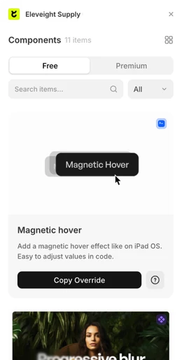
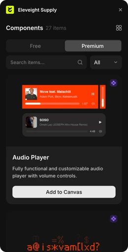
Check out our new companion, the Eleveight Supply Framer plugin. Get quick access to all of your components and overrides right within Framer.
Check out our new companion, the Eleveight Supply plugin. Get quick access to all of your components and overrides right within Framer.





made by Fabian Albert.
Follow us on x.com
Say hello: sales@eleveight.supply
made by Fabian Albert.
Follow us on x.com
Say hello: sales@eleveight.supply
made by Fabian Albert.
Follow us on x.com
Say hello: sales@eleveight.supply


